easyclimate.field.equatorial_wave
Submodules
Functions
|
Create a base map for Madden-Julian Oscillation (MJO) phase space visualization. |
|
Visualize Madden-Julian Oscillation (MJO) phase space trajectory from RMM indices. |
|
Removes the dominant signals by removing the long term linear trend (conserving the mean) and |
|
Decompose data into symmetric and asymmetric parts about the equator. |
|
Calculate Wheeler-Kiladis spectral coefficients. |
|
Plot antisymmetric Wheeler-Kiladis analysis with Matsuno dispersion curves. |
|
Plot symmetric Wheeler-Kiladis analysis with Matsuno dispersion curves. |
Package Contents
- easyclimate.field.equatorial_wave.draw_mjo_phase_space_basemap(ax=None, add_phase_text: bool = True, add_location_text: bool = True)
Create a base map for Madden-Julian Oscillation (MJO) phase space visualization.
This function generates the standardized background diagram for MJO analysis, including phase division lines (1-8), amplitude circles, and optional geographical annotations. The diagram uses RMM1/RMM2 indices as axes in a Cartesian coordinate system (-4 to 4 range).
Parameters
- ax
matplotlib.axes.Axes, optional Target axes object for plotting. If None, uses current axes (gca()).
- add_phase_text
bool, default: True Whether to annotate MJO phase numbers (1-8) on the diagram.
- add_location_text
bool, default: True Whether to annotate geographical regions corresponding to MJO phases: - Pacific Ocean (top) - Indian Ocean (bottom) - Western Hemisphere/Africa (left) - Maritime Continent (right)
Returns
matplotlib.axes.AxesThe configured axes object with MJO phase space basemap elements.
Notes
The diagram includes: 1. 8 radial lines dividing phases (45° intervals) 2. Unit circle indicating amplitude threshold 3. Axes labeled as RMM1 (x-axis) and RMM2 (y-axis)
Examples
>>> import matplotlib.pyplot as plt
>>> fig, ax = plt.subplots()
>>> ecl.field.equatorial_wave.draw_mjo_phase_space_basemap(ax=ax)
>>> plt.show()
- ax

- easyclimate.field.equatorial_wave.draw_mjo_phase_space(mjo_data: xarray.Dataset, rmm1_dim: str = 'RMM1', rmm2_dim: str = 'RMM2', time_dim: str = 'time', ax=None, color='blue', start_text='START', add_start_text: bool = True)
Visualize Madden-Julian Oscillation (MJO) phase space trajectory from RMM indices.
Plots the temporal evolution of MJO phases as a parametric curve in RMM1-RMM2 space, with optional starting point marker. Combines scatter points (individual observations) with connecting lines to show temporal progression.
Parameters
- mjo_data
xarray.Dataset Input dataset containing RMM indices. Must include: - RMM1 component (real-time multivariate MJO index 1) - RMM2 component (real-time multivariate MJO index 2) - Time coordinate
- rmm1_dim
str, default: “RMM1” Variable name for RMM1 component in the dataset
- rmm2_dim
str, default: “RMM2” Variable name for RMM2 component in the dataset
- time_dim
str, default: “time” Time coordinate dimension name
- ax
matplotlib.axes.Axes, optional Target axes for plotting. Creates new axes if None.
- color
stror tuple, default: “blue” Color specification for trajectory and points
- start_text
str, default: “START” Annotation text for trajectory starting point
- add_start_text
bool, default: True Toggle for displaying start point annotation
Returns
matplotlib.axes.AxesConfigured axes object with MJO phase space trajectory
Returns
matplotlib.axes.AxesConfigured axes object with MJO phase space trajectory
Examples
>>> import xarray as xr
>>> import matplotlib.pyplot as plt
>>> # Load RMM indices dataset
>>> mjo_ds = xr.open_dataset('http://iridl.ldeo.columbia.edu/SOURCES/.BoM/.MJO/.RMM/dods', decode_times=False)
>>> T = mjo_ds.T.values
>>> mjo_ds['T'] = pd.date_range("1974-06-01", periods=len(T))
>>> mjo_ds = ecl.utility.get_compress_xarraydata(mjo_ds)
>>> fig, ax = plt.subplots(figsize=(8,8))
>>> ecl.field.equatorial_wave.draw_mjo_phase_space_basemap()
>>> ecl.field.equatorial_wave.draw_mjo_phase_space(
...:    mjo_data = mjo_data.sel(time = slice('2024-12-01', '2024-12-31')),
...:    rmm1_dim = "RMM1",
...:    rmm2_dim = "RMM2",
...:    time_dim = "time"rmm_data, ax=ax, color="red")
>>> plt.title("MJO Phase Space Trajectory")
>>> plt.show()
Note
Recommended to use with
draw_mjo_phase_space_basemap()for basic map.Temporal resolution affects trajectory smoothness (daily data recommended).
- mjo_data
- easyclimate.field.equatorial_wave.remove_dominant_signals(data: xarray.DataArray, spd: float, nDayWin: float, nDaySkip: float, time_dim: str = 'time', lon_dim: str = 'lon', lat_dim: str = 'lat') xarray.DataArray
Removes the dominant signals by removing the long term linear trend (conserving the mean) and by eliminating the annual cycle by removing all time periods less than a corresponding critical frequency.
Parameters
- data
xarray.DataArray Input data array with time, lat, lon dimensions
Caution
data must be daily data, and the length of time should be longer than one year (i.e., >365 day).
- spd
float Samples per day (frequency of observations)
- nDayWin
float Number of days in each analysis window
- nDaySkip
float Number of days to skip between windows
- time_dim
str, optional Name of time dimension, default ‘time’
- lon_dim
str, optional Name of longitude dimension, default ‘lon’
- lat_dim
str, optional Name of latitude dimension, default ‘lat’
Returns
xarray.DataArrayData with dominant signals removed
Example
>>> data = xr.DataArray(np.random.rand(730, 10, 20),
...                    dims=['time', 'lat', 'lon'])
>>> cleaned = remove_dominant_signals(data, spd=1, nDayWin=90, nDaySkip=30)
- data
- easyclimate.field.equatorial_wave.decompose_symasym(da, lat_dim='lat')
Decompose data into symmetric and asymmetric parts about the equator.
The symmetric part is stored in the Southern Hemisphere and the asymmetric part in the Northern Hemisphere.
Parameters
- da
xarray.DataArray Input array with latitude dimension
- lat_dim
str, optional Name of latitude dimension, default ‘lat’
Returns
xarray.DataArrayArray with decomposed components (symmetric in SH, asymmetric in NH)
Example
>>> data = xr.DataArray(np.random.rand(10, 20), dims=['lat', 'lon'])
>>> decomposed = decompose_symasym(data)
- da
- easyclimate.field.equatorial_wave.calc_spectral_coefficients(data: xarray.DataArray, spd: float, nDayWin: float, nDaySkip: float, time_dim: str = 'time', lon_dim: str = 'lon', lat_dim: str = 'lat', max_freq: float = 0.5, max_wn: float = 15)
Calculate Wheeler-Kiladis spectral coefficients.
Parameters
- data
xarray.DataArray Input data array.
Caution
data must be daily data, and the length of time should be longer than one year (i.e., >365 day).
- spd
float Samples per day
- nDayWin
float Number of days in analysis window
- nDaySkip
float Number of days to skip between windows
- time_dim
str, optional Time dimension name, default ‘time’
- lon_dim
str, optional Longitude dimension name, default ‘lon’
- lat_dim
str, optional Latitude dimension name, default ‘lat’
- max_freq
float, optional Maximum frequency to return (CPD), default 0.5
- max_wn
float, optional Maximum wavenumber to return, default 15
Returns
xarray.DatasetDataset containing:
psumanti_r: Antisymmetric power spectrum (background removed)psumsym_r: Symmetric power spectrum (background removed)
Example
>>> data = xr.DataArray(np.random.rand(730, 10, 20),
...                    dims=['time', 'lat', 'lon'])
>>> spectra = calc_spectral_coefficients(data, spd=1, nDayWin=90, nDaySkip=30)
- data
- easyclimate.field.equatorial_wave.draw_wk_anti_analysis(max_freq: float = 0.5, max_wn: float = 15, ax=None, add_xylabel: bool = True, add_central_line: bool = True, add_westward_and_eastward: bool = True, auto_determine_xyrange: bool = True, freq_lines: bool = True, matsuno_modes_labels: bool = True, cpd_lines_levels: list = [3, 6, 30], matsuno_lines: bool = True, he: list = [12, 25, 50], meridional_modes: list = [1])
Plot antisymmetric Wheeler-Kiladis analysis with Matsuno dispersion curves.
Parameters
- max_freq
float, optional Maximum frequency to plot (CPD), default 0.5
- max_wn
float, optional Maximum wavenumber to plot, default 15
- axmatplotlib.axes.Axes, optional
Axes to plot on, creates new if None
- add_xylabel
bool, optional Add x/y labels, default True
- add_central_line
bool, optional Add central vertical line, default True
- add_westward_and_eastward
bool, optional Add eastward/westward labels, default True
- auto_determine_xyrange
bool, optional Auto-set axis ranges, default True
- freq_lines
bool, optional Add frequency lines, default True
- matsuno_modes_labels
bool, optional Add Matsuno mode labels, default True
- cpd_lines_levelslist, optional
Periods (days) for frequency lines, default [3, 6, 30]
- matsuno_lines
bool, optional Plot Matsuno dispersion curves, default True
- helist, optional
Equivalent depths for Matsuno curves, default [12, 25, 50]
- meridional_modeslist, optional
Meridional mode numbers, default [1]
Example
>>> fig, ax = plt.subplots()
>>> draw_wk_anti_analysis(ax=ax)
- max_freq
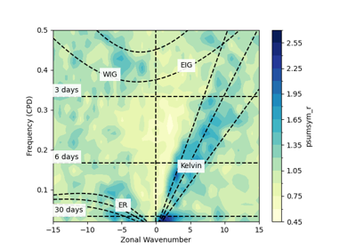
- easyclimate.field.equatorial_wave.draw_wk_sym_analysis(max_freq: float = 0.5, max_wn: float = 15, ax=None, add_xylabel: bool = True, add_central_line: bool = True, add_westward_and_eastward: bool = True, auto_determine_xyrange: bool = True, freq_lines: bool = True, matsuno_modes_labels: bool = True, cpd_lines_levels: list = [3, 6, 30], matsuno_lines: bool = True, he: list = [12, 25, 50], meridional_modes: list = [1])
Plot symmetric Wheeler-Kiladis analysis with Matsuno dispersion curves.
Parameters
- max_freq
float, optional Maximum frequency to plot (CPD), default 0.5
- max_wn
float, optional Maximum wavenumber to plot, default 15
- axmatplotlib.axes.Axes, optional
Axes to plot on, creates new if None
- add_xylabel
bool, optional Add x/y labels, default True
- add_central_line
bool, optional Add central vertical line, default True
- add_westward_and_eastward
bool, optional Add eastward/westward labels, default True
- auto_determine_xyrange
bool, optional Auto-set axis ranges, default True
- freq_lines
bool, optional Add frequency lines, default True
- matsuno_modes_labels
bool, optional Add Matsuno mode labels, default True
- cpd_lines_levelslist, optional
Periods (days) for frequency lines, default [3, 6, 30]
- matsuno_lines
bool, optional Plot Matsuno dispersion curves, default True
- helist, optional
Equivalent depths for Matsuno curves, default [12, 25, 50]
- meridional_modeslist, optional
Meridional mode numbers, default [1]
Example
>>> fig, ax = plt.subplots()
>>> draw_wk_sym_analysis(ax=ax)
- max_freq