easyclimate.plot
Submodules
Functions
|
Utility function to set the boundary of ax to a path that surrounds a |
|
Add a cyclic point to an array and optionally a corresponding coordinate. |
|
Add a cyclic point to an array and optionally a corresponding coordinate. |
Draw significant area by |
|
|
Obtain longitude and latitude array values that meet the conditions within the threshold from a two-dimensional array of p-values |
|
Draw significant area by |
|
Calculating Taylor diagram metadata |
Drawing Taylor Graphics Basic Framework |
|
|
Draw points to Taylor Graphics Basic Framework according to Taylor diagram metadata. |
|
Calculate the center root mean square error. |
|
Setting the axes in longitude format. |
|
Setting the axes in latitude format. |
|
Setting the axes in logarithmic vertical barometric pressure format. |
|
Create geographical and spatial base map. |
|
Create geographical rectangular box. |
|
Create a custom geographical rectangular box with optional rotation. |
|
Plot streamlines of a vector flow. |
|
Add a curved-quiver key to a plot. |
Plot a bar chart with time for a 1D |
|
|
Plot a line chart with proper shading at threshold crossings. |
|
Draw a polar stereographic circular basemap with optional gridlines and |
|
Add a title above a polar circular map using the layout metadata returned |
Package Contents
- easyclimate.plot.draw_Circlemap_PolarStereo(*, lat_range: tuple | list, add_gridlines: bool = True, lon_step: float = None, lat_step: float = None, ax: matplotlib.axes.Axes = None, draw_labels: bool = True, set_map_boundary_kwargs: dict = {}, gridlines_kwargs: dict = {})
Utility function to set the boundary of ax to a path that surrounds a given region specified by latitude and longitude coordinates. This boundary is drawn in the projection coordinates and therefore follows any curves created by the projection. As of now, this works consistently for the North/South Polar Stereographic Projections.
Parameters
- lat_range
tuple,list. The two-tuple containing the start and end of the desired range of latitudes. The first entry must be smaller than the second entry. Both entries must be between [-90 , 90].
- add_gridlines:
bool. whether or not add gridlines and tick labels to a map.
- lon_step:
float. The step of grid lines in longitude.
- lat_step:
float. The step of grid lines in latitude.
- ax
matplotlib.axes.Axes The axes to which the boundary will be applied.
- draw_labels:
bool. Whether to draw labels. Defaults to True.
- **set_map_boundary_kwargs:
dict. Additional keyword arguments to wrapped
geocat.viz.util.set_map_boundary.- **gridlines_kwargs:
dict. Additional keyword arguments to wrapped
cartopy.mpl.gridliner.Gridliner.
See also
geocat.viz.util.set_map_boundary,cartopy.mpl.gridliner.Gridliner.Example(s) related to the function
- lat_range

- easyclimate.plot.add_lon_cyclic(data_input: xarray.DataArray, inter: float, lon_dim: str = 'lon')
Add a cyclic point to an array and optionally a corresponding coordinate.
Parameters
- data_input
xarray.DataArrayorxarray.Dataset The spatio-temporal data to be calculated.
- inter:
float Longitude interval (assuming longitude is arranged in a sequence of equal differences).
- lon_dim:
str, default: lon. Longitude coordinate dimension name. By default extracting is applied over the lon dimension.
- data_input
- easyclimate.plot.add_lon_cyclic_lonarray(data_input: xarray.DataArray, lon_array: numpy.array, lon_dim: str = 'lon')
Add a cyclic point to an array and optionally a corresponding coordinate.
Parameters
- data_input
xarray.DataArrayorxarray.Dataset The spatio-temporal data to be calculated.
- inter:
float Longitude interval (assuming longitude is arranged in a sequence of equal differences).
- lon_dim:
str, default: lon. Longitude coordinate dimension name. By default extracting is applied over the lon dimension.
- data_input
- easyclimate.plot.draw_significant_area_contourf(p_value: xarray.DataArray, thresh: float = 0.05, lon_dim: str = 'lon', lat_dim: str = 'lat', ax: matplotlib.axes.Axes = None, hatches: str = '...', hatch_colors: str = 'k', reverse_level_plot: bool = False, **kwargs) matplotlib.contour.QuadContourSet
Draw significant area by
matplotlib.axes.Axes.contourf.Parameters
- p_value:
xarray.DataArray. The p value data.
- thresh:
float. The threshold value.
- lon_dim:
str, default: lon. Longitude coordinate dimension name. By default extracting is applied over the lon dimension.
- lat_dim:
str, default: lat. Latitude coordinate dimension name. By default extracting is applied over the lat dimension.
- ax
matplotlib.axes.Axes, optional. Axes on which to plot. By default, use the current axes. Mutually exclusive with size and figsize.
- hatches:
list[str], default: … A list of cross hatch patterns to use on the filled areas. If None, no hatching will be added to the contour. Hatching is supported in the PostScript, PDF, SVG and Agg backends only.
- hatch_colors:
str, default: k. The colors of the hatches.
Warning
The parameter
hatch_colorsis not support to changed now.- reverse_level_plot:
bool, default: False. Whether to reverse the drawing area.
- **kwargs, optional:
Additional keyword arguments to
xarray.plot.contourf.
Returns
- p_value:
- easyclimate.plot.get_significance_point(p_value: xarray.DataArray, thresh: float = 0.05, lon_dim: str = 'lon', lat_dim: str = 'lat') pandas.DataFrame
Obtain longitude and latitude array values that meet the conditions within the threshold from a two-dimensional array of p-values
Parameters
- p_value:
xarray.DataArray. The p value data.
- thresh:
float. The threshold value.
- lon_dim:
str, default: lon. Longitude coordinate dimension name. By default extracting is applied over the lon dimension.
- lat_dim:
str, default: lat. Latitude coordinate dimension name. By default extracting is applied over the lat dimension.
Returns
- p_value:
- easyclimate.plot.draw_significant_area_scatter(significant_points_dataframe: pandas.DataFrame, lon_dim: str = 'lon', lat_dim: str = 'lat', ax: matplotlib.axes.Axes = None, **kwargs)
Draw significant area by
matplotlib.axes.Axes.scatter.Parameters
- significant_points_dataframe:
pandas.DataFrame. The data contains the significant points, which is obtained by the
easyclimate.plot.get_significance_point.- lon_dim:
str, default: lon. Longitude coordinate dimension name. By default extracting is applied over the lon dimension.
- lat_dim:
str, default: lat. Latitude coordinate dimension name. By default extracting is applied over the lat dimension.
- ax
matplotlib.axes.Axes, optional Axes on which to plot. By default, use the current axes. Mutually exclusive with size and figsize.
- **kwargs, optional:
Additional keyword arguments to
matplotlib.axes.Axes.scatter.Attention
You must specify kwargs = {‘transform’: ccrs.PlateCarree()} (import cartopy.crs as ccrs) in the cartopy GeoAxes or GeoAxesSubplot, otherwise projection errors may occur.
- significant_points_dataframe:
- easyclimate.plot.calc_TaylorDiagrams_metadata(f: xarray.DataArray, r: xarray.DataArray, models_name: list[str] = [], weighted: bool = False, lat_dim: str = 'lat', normalized: bool = True)
Calculating Taylor diagram metadata
Parameters
- f:
xarray.DataArray, required. A spatial array of models to be compared.
- r:
xarray.DataArray, required. A spatial array for model reference comparisons (observations).
- model_name:
list[str], required. The list of the models’ name.
- weighted:
bool, default False. Whether to weight the data by latitude or not? The default value is False.
- lat_dim:
str, default lat. The name of latitude coordinate name.
- normalized:
bool, default True, optional. Whether the standard deviations is normalized, that is standard deviation of the model divided by that of the observations.
Returns
Examples
>>> import xarray as xr
>>> import pandas as pd
>>> import numpy as np
>>> import easyclimate as ecl
>>> da_a = xr.DataArray(
...:     np.array([[1, 2, 3], [0.1, 0.2, 0.3], [3.2, 0.6, 1.8]]),
...:     dims = ("lat", "time"),
...:     coords= {'lat': np.array([-30, 0, 30]),
...:              'time': pd.date_range("2000-01-01", freq="D", periods=3)
...:              }
...:)
>>> da_a
<xarray.DataArray (lat: 3, time: 3)>
array([[1. , 2. , 3. ],
    [0.1, 0.2, 0.3],
    [3.2, 0.6, 1.8]])
Coordinates:
* lat      (lat) int32 -30 0 30
* time     (time) datetime64[ns] 2000-01-01 2000-01-02 2000-01-03
>>>  da_b = xr.DataArray(
...:     np.array([[0.2, 0.4, 0.6], [15, 10, 5], [3.2, 0.6, 1.8]]),
...:     dims = ("lat", "time"),
...:     coords= {'lat': np.array([-30, 0, 30]),
...:              'time': pd.date_range("2000-01-01", freq="D", periods=3)
...:              }
...:)
>>>  da_b
<xarray.DataArray (lat: 3, time: 3)>
array([[ 0.2,  0.4,  0.6],
    [15. , 10. ,  5. ],
    [ 3.2,  0.6,  1.8]])
Coordinates:
* lat      (lat) int32 -30 0 30
* time     (time) datetime64[ns] 2000-01-01 2000-01-02 2000-01-03
>>>  da_obs = (da_a + da_b) / 1.85
>>>  da_obs
<xarray.DataArray (lat: 3, time: 3)>
array([[0.64864865, 1.2972973 , 1.94594595],
    [8.16216216, 5.51351351, 2.86486486],
    [3.45945946, 0.64864865, 1.94594595]])
Coordinates:
* lat      (lat) int32 -30 0 30
* time     (time) datetime64[ns] 2000-01-01 2000-01-02 2000-01-03
>>>  ecl.calc_TaylorDiagrams_metadata(
...:     f = [da_a, da_b],
...:     r = [da_obs, da_obs],
...:     models_name = ['f1', 'f2'],
...:     weighted = True,
...:     normalized = True,
...:)
item       std                   cc  centeredRMS       TSS
0  Obs  1.000000                  1.0     0.000000  1.002003
1   f1  0.404621  -0.4293981636461462     1.229311  0.003210
2   f2  2.056470    0.984086060161888     1.087006  0.600409
- f:
- easyclimate.plot.draw_TaylorDiagrams_base(ax: matplotlib.axes.Axes = None, half_circle: bool = False, normalized: bool = True, std_min: float = 0, std_max: float = 2, std_interval: float = 0.25, arc_label: str = 'Correlation', arc_label_pad: float = 0.2, arc_label_kwargs: dict = {'fontsize': 12}, arc_ticker_kwargs: dict = {'lw': 0.8, 'c': 'black'}, arc_tickerlabel_kwargs: dict = {'labelsize': 12, 'pad': 8}, arc_ticker_length: float = 0.02, arc_minorticker_length: float = 0.01, x_label: str = 'Std (Normalized)', x_label_pad: float = 0.25, x_label_kwargs: dict = {'fontsize': 12}, x_ticker_length: float = 0.02, x_tickerlabel_kwargs: dict = {'fontsize': 12}, x_tickerlabel_pad: float | None = None, y_tickerlabel_pad: float | None = None, x_ticker_kwargs: dict = {'lw': 0.8, 'c': 'black'}, y_ticker_kwargs: dict = {'lw': 0.8, 'c': 'black'}) matplotlib.collections.Collection
Drawing Taylor Graphics Basic Framework
Parameters
- ax:
matplotlib.axes.Axes, optional. Axes on which to plot. By default, use the current axes, i.e. ax = plt.gca().
- half_circle:
bool, default False, optional. Whether to draw the ‘half-circle’ version of the Taylor diagram.
- normalized:
bool, default True, optional. Whether the standard deviations is normalized, that is standard deviation of the model divided by that of the observations. This parameter mainly affects the label x=1 on the x axis, if normalized to True, it is rewritten to REF.
- std_min:
float, default 0.0, optional. Minimum value of x-axis (standard deviation) on Taylor diagram.
Note
The value of std_min shoud be 0 in the ‘half-circle’ version of the Taylor diagram.
- std_max:
float, default 2.0, optional. Maximum value of x-axis (standard deviation) on Taylor diagram.
- std_interval:
float, default 0.25, optional. The interval between the ticker on the x-axis (standard deviation) between the minimum and maximum values on the Taylor diagram.
- arc_label:
str, default ‘Correlation’, optional. Label on Taylor chart arc, default value is ‘Correlation’.
- arc_label_pad:
float, default 0.2, optional. The offset of the title from the top of the arc, based on x-axis based coordinate system.
- arc_label_kwargs:
dict, default {‘fontsize’: 12}, optional. Additional keyword arguments passed on to labels on arcs, according to other miscellaneous parameters in`matplotlib.axes.Axes.text`.
- arc_ticker_kwargs:
dict, default {‘lw’: 0.8, ‘c’: ‘black’}, optional. Additional keyword arguments passed on to tickers on arcs, according to other miscellaneous parameters in`matplotlib.axes.Axes.plot`.
- arc_tickerlabel_kwargs:
dict, default {‘labelsize’: 12, ‘pad’: 8}, optional. Additional keyword arguments passed on to tickers on arcs, according to other miscellaneous parameters in`matplotlib.axes.Axes.tick_params`.
- arc_ticker_length:
float, default 0.02, optional. Ticker length on arc.
- arc_minorticker_length:
float, default 0.01, optional. Minor ticker length on arc.
- x_label:
str, default ‘Std (Normalized)’, optional. Label on Taylor chart x axis, default value is ‘Std (Normalized)’.
- x_label_pad:
float, default 0.25, optional. The offset of the title from the top of the x-axis, based on x-axis based coordinate system.
- x_label_kwargs:
dict, default {‘fontsize’: 12}, optional. Additional keyword arguments passed on to labels on x-axis, according to other miscellaneous parameters in`matplotlib.axes.Axes.text`.
- x_ticker_length:
float, default 0.02, optional. Ticker length on x-axis
- x_tickerlabel_kwargs:
dict, default {‘fontsize’: 12}, optional. Additional keyword arguments passed on to tickers’ labels on x-axis, according to other miscellaneous parameters in`matplotlib.axes.Axes.text`.
- x_tickerlabel_pad:
float, optional. The spacing between the horizontal axis and its tick labels in points when half_circle is False. Positive values move labels away from the horizontal axis. If None, use the original text-based spacing.
- y_tickerlabel_pad:
float, optional. The spacing between the vertical axis and its tick labels in points when half_circle is False. Positive values move labels away from the vertical axis. If None, use the original text-based spacing.
- x_ticker_kwargs:
dict, default {‘lw’: 0.8, ‘c’: ‘black’}, optional. Additional keyword arguments passed on to tickers on x-axis, according to other miscellaneous parameters in`matplotlib.axes.Axes.plot`.
- y_ticker_kwargs:
dict, default {‘lw’: 0.8, ‘c’: ‘black’}, optional. Additional keyword arguments passed on to tickers on y-axis, according to other miscellaneous parameters in`matplotlib.axes.Axes.plot`.
Returns
- ax:
- easyclimate.plot.draw_TaylorDiagrams_metadata(taylordiagrams_metadata: pandas.DataFrame, marker_list: list | None = None, color_list: list | None = None, label_list: list | None = None, legend_list: list | None = None, ax: matplotlib.axes.Axes = None, normalized: bool = True, cc: str = 'cc', std: str = 'std', point_label_xoffset: float = 0, point_label_yoffset: float = 0.05, point_kwargs: dict | list[dict] = {'alpha': 1, 'markersize': 6.5}, point_label_kwargs: dict | list[dict] = {'fontsize': 14}) dict
Draw points to Taylor Graphics Basic Framework according to Taylor diagram metadata.
Parameters
- taylordiagrams_metadata:
pandas.DataFrame, required. Taylor diagram metadata generated by the function calc_TaylorDiagrams_metadata.
- marker_list:
list, optional. The list of markers. The order of marker in marker_list is determined by the order in taylordiagrams_metadata. See matplotlib.markers for full description of possible arguments. If None, use “o” for all data points.
- color_list:
list, optional. The list of colors. The order of color in color_list is determined by the order in taylordiagrams_metadata. If None, use Matplotlib’s default color cycle.
- label_list:
list, optional. The list of data point labels (marked next to plotted points). The order of label in label_list is determined by the order in taylordiagrams_metadata. If None, do not draw text labels next to data points.
- legend_list:
list, optional. The list of legend label. The order of label in legend_list is determined by the order in taylordiagrams_metadata. If None, use the item column in taylordiagrams_metadata.
- ax:
matplotlib.axes.Axes, optional. Axes on which to plot. By default, use the current axes, i.e. ax = plt.gca().
- normalized:
bool, default True, optional. Whether the standard deviations is normalized, that is standard deviation of the model divided by that of the observations.
- cc:
str, default ‘cc’, optional. The name of correlation coefficient in taylordiagrams_metadata.
- std:
str, default ‘std’, optional. The name of standard deviation in taylordiagrams_metadata.
- point_label_xoffset:
float, optional. The offset of the labels from the points, based on x-axis based coordinate system.
- point_label_yoffset:
float, optional. The offset of the labels from the points, based on y-axis based coordinate system.
- point_kwargs:
dictorlistofdict, optional. Additional keyword arguments passed on to data points, according to other miscellaneous parameters in`matplotlib.axes.Axes.plot`. If it is a list, each element is applied to the corresponding data point. If it is a dictionary whose values are dictionaries, each element is selected by data point item, legend, label, or row index.
- point_label_kwargs:
dictorlistofdict, optional. Additional keyword arguments passed on to the labels of data points, according to other miscellaneous parameters in`matplotlib.axes.Axes.text`. If it is a list, each element is applied to the corresponding data point. If it is a dictionary whose values are dictionaries, each element is selected by data point item, legend, label, or row index.
Returns
dict.A dictionary keyed by data point item. Each value includes the point artist, label artist, point keyword arguments, and label keyword arguments.
- taylordiagrams_metadata:
- easyclimate.plot.calc_TaylorDiagrams_values(f: xarray.DataArray, r: xarray.DataArray, model_name: str, weighted: bool = False, lat_dim: str = 'lat', normalized: bool = True, r0: float = 0.999) pandas.DataFrame
Calculate the center root mean square error.
where \(N\) is the number of points in spatial pattern.
Parameters
- f
xarray.DataArray, required. A spatial array of models to be compared.
- r
xarray.DataArray, required. A spatial array for model reference comparisons (observations).
- model_name:
str, required. The name of the model.
- weighted:
bool, default False. Whether to weight the data by latitude or not? The default value is False.
- lat_dim:
str, default lat. The name of latitude coordinate name.
- normalized:
bool, default True, optional. Whether the standard deviations is normalized, that is standard deviation of the model divided by that of the observations.
- r0
float, optional. Maximum correlation obtainable.
Attention
f and r must have the same two-dimensional spatial dimension.
Returns
Reference
Taylor, K. E. (2001), Summarizing multiple aspects of model performance in a single diagram, J. Geophys. Res., 106(D7), 7183-7192, doi:10.1029/2000JD900719.
- f
- easyclimate.plot.set_lon_format_axis(ax: matplotlib.axes.Axes = None, axis: str = 'x', **kwargs)
Setting the axes in longitude format.
Parameters
- ax
matplotlib.axes.Axes The axes to which the boundary will be applied.
- axis: {‘x’, ‘y’}, default: ‘x’
The axis to which the parameters are applied.
- **kwargs
Additional keyword arguments to wrapped
matplotlib.axis.Axis.set_major_formatter.
Example(s) related to the function
- ax
- easyclimate.plot.set_lat_format_axis(ax: matplotlib.axes.Axes = None, axis: str = 'y', **kwargs)
Setting the axes in latitude format.
Parameters
- ax
matplotlib.axes.Axes The axes to which the boundary will be applied.
- axis: {‘x’, ‘y’}, default: ‘y’
The axis to which the parameters are applied.
- **kwargs
Additional keyword arguments to wrapped
matplotlib.axis.Axis.set_major_formatter.
Example(s) related to the function
- ax
- easyclimate.plot.set_p_format_axis(ax: matplotlib.axes.Axes = None, axis: str = 'y', axis_limits: tuple = (1000, 100), ticker_step: float = 100)
Setting the axes in logarithmic vertical barometric pressure format.
Parameters
- ax
matplotlib.axes.Axes The axes to which the boundary will be applied.
- axis: {‘x’, ‘y’}, default: ‘y’
The axis to which the parameters are applied.
- axis_limits:
tuple, default (1000, 100). Assuming that the distribution of coordinates exhibits an isotropic series distribution, this item sets the maximum value (near surface air pressure) and the minimum value (near overhead air pressure).
- ticker_step:
float, default 100. Assuming an isotropic series of coordinate distributions, the term sets the tolerance.
Example(s) related to the function
- ax
- easyclimate.plot.quick_draw_spatial_basemap(nrows: int = 1, ncols: int = 1, figsize=None, central_longitude: float = 0.0, draw_labels: str | bool | list | dict = ['bottom', 'left'], gridlines_color: str = 'grey', gridlines_alpha: float = 0.5, gridlines_linestyle: str = '--', coastlines_edgecolor: str = 'black', coastlines_kwargs: dict = {'lw': 0.5})
Create geographical and spatial base map.
Parameters
- nrows, ncols
int, default: 1 Number of rows/columns of the subplot grid.
- figsize: (
float,float) Width, height in inches.
- central_longitude:
float, default: 0. The central longitude for cartopy.crs.PlateCarree projection.
- draw_labels:
str|bool|list|dict, default: [“bottom”, “left”]. Toggle whether to draw labels. For finer control, attributes of Gridliner may be modified individually.
string: “x” or “y” to only draw labels of the respective coordinate in the CRS.
list: Can contain the side identifiers and/or coordinate types to select which ones to draw. For all labels one would use [“x”, “y”, “top”, “bottom”, “left”, “right”, “geo”].
dict: The keys are the side identifiers (“top”, “bottom”, “left”, “right”) and the values are the coordinates (“x”, “y”); this way you can precisely decide what kind of label to draw and where. For x labels on the bottom and y labels on the right you could pass in {“bottom”: “x”, “left”: “y”}.
Note that, by default, x and y labels are not drawn on left/right and top/bottom edges respectively unless explicitly requested.
- gridlines_color:
str, default: grey. The parameter color for ax.gridlines.
- gridlines_alpha:
float, default: 0.5. The parameter alpha for ax.gridlines.
- gridlines_linestyle:
str, default: “–”. The parameter linestyle for ax.gridlines.
- coastlines_edgecolor:
str, default: “black”. The parameter color for ax.coastlines.
- coastlines_kwargs:
float, default:{"lw": 0.5}. The kwargs for ax.coastlines.
Returns
fig:
Figureax:
Axesor array of Axes: ax can be either a singleAxesobject, or an array of Axes objects if more than one subplot was created. The dimensions of the resulting array can be controlled with the squeeze keyword.
See also
matplotlib.pyplot.subplotscartopy.mpl.geoaxes.GeoAxes.gridlinescartopy.mpl.geoaxes.GeoAxes.coastlines- nrows, ncols
- easyclimate.plot.quick_draw_standard_rectangular_box(lon1: float, lon2: float, lat1: float, lat2: float, ax: matplotlib.axes.Axes = None, **patches_kwargs)
Create geographical rectangular box.
Parameters
- lon1, lon2:
float. Rectangular box longitude point. The applicable value should be between -180 \(^\circ\) and 360 \(^\circ\). lon1 and lon2 must have a certain difference, should not be equal, do not strictly require the size relationship between lon1 and lon2.
- lat1, lat2:
float. Rectangular box latitude point. The applicable value should be between -90 \(^\circ\) and 90 \(^\circ\). lat1 and lat2 must have a certain difference, should not be equal, do not strictly require the size relationship between lat1 and lat2.
- ax
matplotlib.axes.Axes, optional. Axes on which to plot. By default, use the current axes. Mutually exclusive with size and figsize.
- **patches_kwargs:
Patch properties. see more in
matplotlib.patches.Patch
See also
- lon1, lon2:
- easyclimate.plot.quick_draw_custom_rectangular_box(lon1: float, lon2: float, lat1: float, lat2: float, ax: matplotlib.axes.Axes = None, angle: float = 0.0, center: Literal['center', 'lowerleft'] = 'center', geo: bool = True, lat0: float | None = None, **patches_kwargs)
Create a custom geographical rectangular box with optional rotation.
Parameters
- lon1, lon2:
float. Rectangular box longitude point. The applicable value should be between -180 \(^\circ\) and 360 \(^\circ\). lon1 and lon2 are used to define the unrotated box extent, and do not strictly require the size relationship between them.
- lat1, lat2:
float. Rectangular box latitude point. The applicable value should be between -90 \(^\circ\) and 90 \(^\circ\). lat1 and lat2 are used to define the unrotated box extent, and do not strictly require the size relationship between them.
- ax
matplotlib.axes.Axes, optional. Axes on which to plot. By default, use the current axes.
- angle:
float, default: 0.0. Counterclockwise rotation angle in degrees.
- center:
str, default: “center”. Rotation pivot of the rectangular box.
“center”: rotate around the box center.
“lowerleft”: rotate around the lower-left corner of the box.
- geo:
bool, default: True. Whether to apply local geographical metric correction before rotation. If True, longitude is scaled by \(\cos(lat0)\) so that longitude and latitude have a locally comparable distance scale.
- lat0:
float, optional. Reference latitude used when geo=True for the longitude scaling. If None, the center latitude of the rectangular box is used.
- **patches_kwargs:
Patch properties. see more in
matplotlib.patches.Patch
Returns
- poly:
Polygon The polygon patch added to the axes.
- poly:
- corners_rot:
numpy.ndarray Rotated corner coordinates of shape (4, 2) in longitude-latitude order.
- corners_rot:
See also
- lon1, lon2:
- easyclimate.plot.curved_quiver(ds: xarray.Dataset, x: collections.abc.Hashable, y: collections.abc.Hashable, u: collections.abc.Hashable, v: collections.abc.Hashable, ax: matplotlib.axes.Axes | None = None, density=1, linewidth=None, color=None, cmap=None, norm=None, arrowsize=1, arrowstyle='-|>', transform=None, zorder=None, start_points=None, integration_direction='both', grains=15, broken_streamlines=True, regrid_shape: int | tuple[int, int] | None = None, ref_magnitude: float | None = None, ref_length: float | None = None, min_frac_length: float = 0.0, length_norm: Literal['reference', 'max', 'percentile'] = 'reference', mask_density: int | tuple[int, int] = 10, line_start_stride: int = 1, arrow_stride: int = 1, min_distance: float = 0.0, arrow_head_ratio: float = 1.0, arrow_position: float = 1.0) easyclimate.plot.modplot.CurvedQuiverplotSet
Plot streamlines of a vector flow.
Parameters
- ds:
xarray.Dataset. Wind dataset.
- x: Hashable or None, optional.
Variable name for x-axis.
- y: Hashable or None, optional.
Variable name for y-axis.
- u: Hashable or None, optional.
Variable name for the u velocity (in x direction).
- v: Hashable or None, optional.
Variable name for the v velocity (in y direction).
- ax:
matplotlib.axes.Axes, optional. Axes on which to plot. By default, use the current axes. Mutually exclusive with size and figsize.
- density:
floator (float,float) Controls the closeness of streamlines. When
density = 1, the domain is divided into a 30x30 grid. density linearly scales this grid. Each cell in the grid can have, at most, one traversing streamline. For different densities in each direction, use a tuple (density_x, density_y).- linewidth:
floator 2D array The width of the streamlines. With a 2D array the line width can be varied across the grid. The array must have the same shape as u and v.
- color: color or 2D array
The streamline color. If given an array, its values are converted to colors using cmap and norm. The array must have the same shape as u and v.
- cmap, norm
Data normalization and colormapping parameters for color; only used if color is an array of floats. See ~.Axes.imshow for a detailed description.
- arrowsize:
float Scaling factor for the arrow size.
- arrowstyle:
str Arrow style specification. See ~matplotlib.patches.FancyArrowPatch.
- start_points: (N, 2) array
Coordinates of starting points for the streamlines in data coordinates (the same coordinates as the x and y arrays).
- zorder:
float The zorder of the streamlines and arrows. Artists with lower zorder values are drawn first.
- integration_direction: {‘forward’, ‘backward’, ‘both’}, default: ‘both’
Integrate the streamline in forward, backward or both directions.
- broken_streamlines:
bool, default: True If False, forces streamlines to continue until they leave the plot domain. If True, they may be terminated if they come too close to another streamline.
- regrid_shape:
intor (int,int) or None, default: None Regrid the vector field onto a regular grid in the target map projection, similar to cartopy’s quiver and barbs methods. This is only supported when plotting on a cartopy GeoAxes and transform is provided.
- ref_magnitude:
floator None, default: None Reference vector magnitude used to convert field magnitude into curved vector length. If None, use the rule defined by length_norm.
- ref_length:
floator None, default: None Reference curved-vector length in the internal axes-normalized scale. If None, keep the previous density/grains-based behavior.
- min_frac_length:
float, default: 0.0 Minimum fraction of ref_length retained for weak vectors.
- length_norm: {“reference”, “max”, “percentile”}, default:
"reference" Fallback normalization rule used when ref_magnitude is not explicitly provided.
- mask_density:
intor tuple, default: 10 Density of the occupancy mask used to avoid overly dense curved vectors.
- line_start_stride:
int, default: 1 Seed-point subsampling stride.
- arrow_stride:
int, default: 1 Segment stride for placing multiple arrow heads along a curved trajectory.
- min_distance:
float, default: 0.0 Minimum spacing between generated seed points in data coordinates.
- arrow_head_ratio:
float, default: 1.0 Multiplier applied to arrow-head size independently of line length.
- arrow_position:
float, default: 0.8 Relative position of the first arrow along each trajectory. Larger values move the arrow closer to the front/head of the curved vector.
Returns
easyclimate.plot.modplot.CurvedQuiverplotSetContainer object with attributes
lines: .LineCollection of streamlinesarrows: .PatchCollection containing .FancyArrowPatch objects representing the arrows half-way along streamlines.This container will probably change in the future to allow changes to the colormap, alpha, etc. for both lines and arrows, but these changes should be backward compatible.
See also
- ds:
- easyclimate.plot.add_curved_quiverkey(curved_quiver: easyclimate.plot.modplot.CurvedQuiverplotSet, pos: tuple[float, float], U: float, label: str, ax: matplotlib.axes.Axes | None = None, color: str = 'black', angle: float = 0, labelpos: Literal['N', 'S', 'E', 'W'] = 'N', labelsep: float = 0.02, labelcolor: str = None, fontproperties: dict = None, zorder=None, ref_point=None)
Add a curved-quiver key to a plot.
The key is drawn in axes coordinates and represents a reference vector magnitude for the object returned by
CurvedQuiverplotSet. Its length is scaled consistently with the internal normalization used by the curved-quiver algorithm. When plotting on projected axes, a local projected length can optionally be estimated using a reference point.Parameters
- curved_quiver:
easyclimate.plot.modplot.CurvedQuiverplotSet The curved-quiver object.
- ax:
matplotlib.axes.Axes Axes on which to draw the quiver key.
- pos: tuple[float, float]
Position
(x, y)of the quiver key in axes coordinates. For example,(0.5, 0.5)places the key at the center of the axes. Values outside the[0, 1]range are allowed so the key can be drawn outside the axes frame.- U:
float Vector magnitude represented by the quiver key.
- label:
str Label displayed alongside the quiver key.
- color: matplotlib color, default:
"black" Color of both the key arrow and the label text unless [labelcolor](src/easyclimate/plot/curved_quiver_plot.py:168) is given.
- angle:
float, default: 0 Arrow angle in degrees, measured counterclockwise from the positive x-direction of the axes.
- labelpos: {‘N’, ‘S’, ‘E’, ‘W’}, default:
'N' Position of the label relative to the arrow:
'N': above the arrow,'S': below the arrow,'E': at the arrow-head side,'W': at the arrow-tail side.
- labelsep:
float, default: 0.02 Separation between the arrow and the label in axes coordinates.
- labelcolor: matplotlib color or None, default: None
Color of the label text.
- fontproperties:
dictormatplotlib.font_manager.FontPropertiesor None, default: None Font properties passed to
matplotlib.axes.Axes.text()when drawing the label.- zorder:
floator None, default: None Drawing order of the quiver key. If None, a default value above the curved quiver is used.
- ref_point: tuple[float, float] or None, default: None
Optional reference point
(x, y)in data coordinates. When provided on projected axes, the key length is converted using the local projection scale near this point, so the displayed key length is more representative of the curved-quiver length at that location. For non-projected axes, this parameter is usually unnecessary.
Note
For projected axes, the displayed length of a vector can vary with location. Supplying
ref_pointmakes the quiver key correspond to a local projected length near that position.- curved_quiver:
- easyclimate.plot.bar_plot_with_threshold(da: xarray.DataArray, width=0.8, threshold: float = 0, pos_color: str = 'red', neg_color: str = 'blue', ax=None, **kwargs) matplotlib.container.BarContainer
Plot a bar chart with time for a 1D
xarray.DataArraywith bars colored based on a threshold value.Parameters:
- da
xarray.DataArray 1-dimensional data array to plot
- width:
floator array-like, default: 0.8 The width(s) of the bars.
Note
If x has units (e.g., datetime), then the width is converted to a multiple of the width relative to the difference units of the x values (e.g., time difference).
- threshold
float, optional Threshold value for color separation (default: 0)
- pos_color
str, optional Color for bars ≥ threshold (default: ‘red’)
- neg_color
str, optional Color for bars < threshold (default: ‘blue’)
- axmatplotlib axes, optional
Axes object to plot on (uses current axes if None)
- **kwargs :
Additional arguments passed to plt.bar
Returns:
- matplotlib.container.BarContainer
The bar plot object
See also
- da
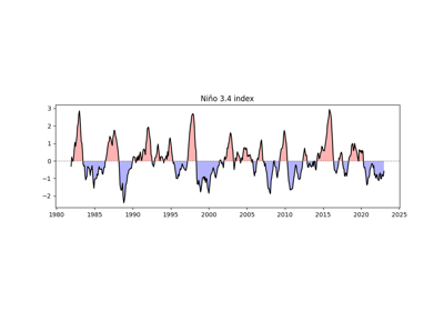
- easyclimate.plot.line_plot_with_threshold(da: xarray.DataArray, threshold: float = 0, pos_color: str = 'red', neg_color: str = 'blue', ax=None, line_plot: bool = True, fill_pos_plot: bool = True, fill_neg_plot: bool = True, line_kwargs=None, fill_kwargs=None) tuple
Plot a line chart with proper shading at threshold crossings.
Parameters:
- da
xarray.DataArray 1-dimensional data array
- threshold
float, optional Color separation threshold (default: 0)
- pos_color
str, optional Color for values ≥ threshold (default: ‘red’)
- neg_color
str, optional Color for values < threshold (default: ‘blue’)
- axmatplotlib axes, optional
Axes to plot on (default: current axes)
- line_kwargs
dict, optional Arguments for plt.plot
- fill_kwargs
dict, optional Arguments for plt.fill_between
Returns:
- tuple
(line plot, fill objects)
See also
matplotlib.lines.Line2DExample(s) related to the function
- da
- easyclimate.plot.draw_polar_basemap(*, lat_range: list, add_gridlines: bool = True, lon_step: float = None, lat_step: float = None, ax=None, draw_labels: bool = True, lat_label_lon: float | None = None, lon_label_lat: float | None = None, lon_label_pad_deg: float = -4.0, set_map_boundary_kwargs: dict | None = None, gridlines_kwargs: dict | None = None, lat_label_kwargs: dict | None = None, lon_label_kwargs: dict | None = None)
Draw a polar stereographic circular basemap with optional gridlines and manually positioned coordinate labels.
This function is designed for north and south polar stereographic maps. It first clips the map boundary into a circular polar view, then optionally adds longitude and latitude gridlines, and finally places readable manual latitude and longitude labels around the polar boundary.
Parameters
- lat_range: list[float] | tuple[float, float]
Latitude range used to define the circular polar boundary, such as
[50, 90]for the Northern Hemisphere or[-90, -50]for the Southern Hemisphere.- add_gridlines:
bool, default:True Whether to draw longitude and latitude gridlines.
- lon_step: float, optional
Interval of longitude gridlines and longitude labels in degrees. This parameter must be specified when add_gridlines=True or draw_labels=True.
- lat_step:
float, optional Interval of latitude gridlines and latitude labels in degrees. This parameter must be specified when add_gridlines=True or when manual latitude labels are enabled.
- ax: cartopy.mpl.geoaxes.GeoAxesSubplot, optional
Target axes with a polar stereographic projection. (uses current axes if None)
- draw_labels:
bool, default:True Whether to manually draw latitude and longitude labels.
- lat_label_lon:
float| None, optional Longitude at which latitude labels are placed.
- lon_label_lat:
float| None, optional Latitude at which longitude labels are placed. If not provided, it is inferred from the lower edge of lat_range plus lon_label_pad_deg.
- lon_label_pad_deg:
float, default:-4.0 Padding, in degrees latitude, used to shift longitude labels relative to the outer latitude boundary.
- set_map_boundary_kwargs:
dict| None, optional Additional keyword arguments passed to when constructing the circular boundary.
- north_pad
int A constant to be added to the second entry in lat_range. Use this if the northern edge of the plot is cut off. Defaults to 0.
- north_pad
- south_pad
int A constant to be subtracted from the first entry in lat_range. Use this if the southern edge of the plot is cut off. Defaults to 0.
- south_pad
- east_pad
int A constant to be added to the second entry in lon_range. Use this if the eastern edge of the plot is cut off. Defaults to 0.
- east_pad
- west_pad
int A constant to be subtracted from the first entry in lon_range. Use this if the western edge of the plot is cut off. Defaults to 0.
- west_pad
- gridlines_kwargs:
dict| None, optional Additional keyword arguments passed to
cartopy.mpl.geoaxes.GeoAxes.gridlineswhen drawing gridlines.- lat_label_kwargs:
dict| None, optional Additional text style options for latitude labels.
- lon_label_kwargs:
dict| None, optional Additional text style options for longitude labels.
Returns
- gl:
cartopy.mpl.gridliner.Gridlineror None The gridliner object returned by Cartopy. If add_gridlines=False,
Noneis returned.- meta:
dict Metadata dictionary describing the polar label layout. It can be passed directly to
set_polar_titleto help position titles above the circular map.
Example(s) related to the function
- easyclimate.plot.set_polar_title(title: str, meta: dict, ax=None, *, loc: Literal['left', 'center', 'right'] = 'center', dy: float | None = None, xpad: float = 0.02, auto_dy_factor: float = 1.2, **text_kwargs)
Add a title above a polar circular map using the layout metadata returned by
draw_polar_basemap.This function estimates the uppermost position of manually placed longitude labels on a polar map, then places the title slightly above them so that the title does not overlap with the circular boundary labels.
Parameters
- title:
str Title text.
- meta:
dict Metadata dictionary returned by
draw_polar_basemap. It must at least contain lon_step and lon_label_lat.- ax: cartopy.mpl.geoaxes.GeoAxesSubplot
Polar stereographic axes on which the title will be drawn.
- loc: {“left”, “center”, “right”}, default:
"center" Horizontal alignment of the title.
- dy:
float| None, optional Vertical offset in axes coordinates relative to the topmost longitude label position. If
None, the offset is estimated automatically from the font size.- xpad:
float, default:0.02 Horizontal padding used when loc is
"left"or"right".- auto_dy_factor:
float, default:1.2 Multiplicative factor used when automatically converting font height into a safe vertical title offset.
- **text_kwargs
Additional keyword arguments passed to
matplotlib.axes.Axes.text.
Returns
matplotlib.text.TextThe created title text artist.
Note
If dy is
None, the function automatically computes a reasonable vertical offset based on the rendered font size, which is usually the most robust option for polar circular maps.Example(s) related to the function
- title: